Today, Friday, the market saw some selling pressure. Why would that be? I don’t know, and neither does anyone else. Though “market experts,” to be sure knew why there were more sellers than buyers. Actually, there is always as many sellers as buyers, as it takes two to make a trade at any price. But the buyers were offering less today, than earlier in the week. Maybe baby needs a new pair of shoes, so Wall Street had to suffer? Life just isn’t fair.
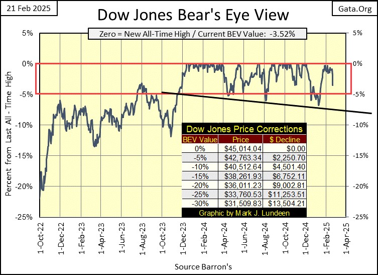
Friday’s damage to the market is easily seen in the Bear’s Eye View chart for the Dow Jones below. Today, the Dow Jones was down 1.66%, leaving it with a BEV of -3.52%. Looks bad, doesn’t it?
But the question in my mind is; did the Dow Jones close the week in scoring position, with a BEV somewhere between 0% and -5%? Why yes it did, so I think Friday’s down day is much to do about nothing, that the Dow Jones is still in position for additional BEV Zeros (0.0% = New All-Time Highs) in the weeks and months to come.
The only thing that can change that would be, seeing the Dow Jones drop below its BEV -5% line, and keep going down to below its BEV -10% line. Or as seen in the table I placed on the chart, a Dow Jones close below 40,512. As far as I’m concerned, that would be a solid sell signal.
I added a black trend line in the chart above, to highlight something. The Dow Jones entered scoring position in November 2023, fifteen months ago. For all this time, the Dow Jones daily closed within scoring position, except for three times;
- April 2024,
- August 2024,
- January 2025.
Note how with each of the above declines from scoring position, the Dow Jones fell deeper than the time before, then returned to scoring position, where it made additional new all-time highs.
But what happens the next time the Dow Jones falls below scoring position? Will it break below that black trend line, and keep going down? Investors tend to have this bad habit of thinking what has been, will continue for a long time to come. But things change all the time in the market.
Fifteen months, where the Dow Jones increased from 35,151 on 20 November 2023, to 45,014 on 04 December 2024. That is a fifteen month, 28% advance, where the Dow Jones made fifty-five new all-time highs. That is a darn good advance, is it reasonable assuming the next fifteen months will be like the last?
So, what should someone do? I recommend for as long as the Dow Jones remains in scoring position, daily close above its BEV -5% line, hang on tight, and enjoy the market’s rising prices. Just realize that no advance lasts forever. Seeing the Dow Jones close below that black trend line above, and then break below its BEV -10% line, it’s time to lock in your profits and exit the market.
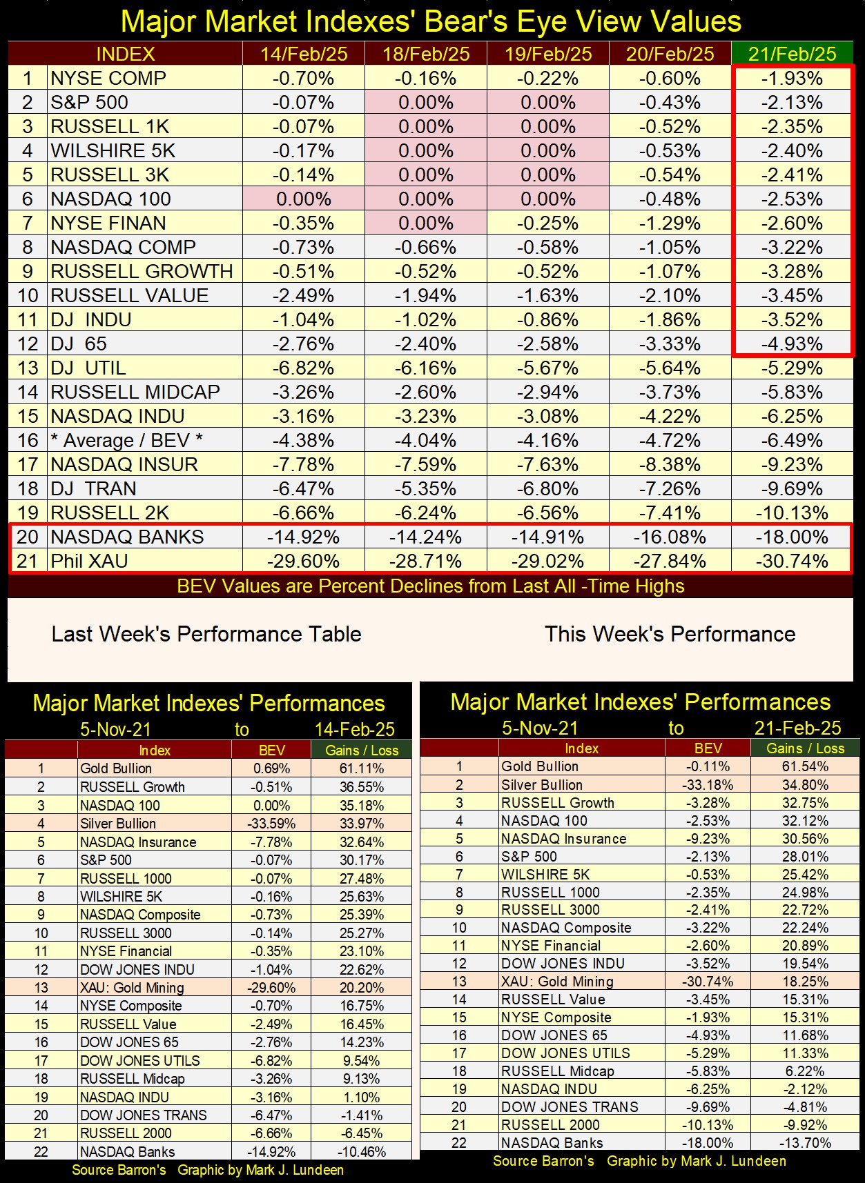
Below we see the major market indexes I follow in BEV terms;
- 0.00% = new all-time high,
- BEV’s below 0.00% = percentage claw-backs from their last all-time highs.
Monday to Wednesday, the market saw some BEV Zeros (0.00%). Then came Thursday and Friday, and the market sold off some. Still, on Friday’s close, twelve of these indexes closed in scoring position, leaving me to believe this is a market with more room to the upside.
But how much more upside does a fifteen-month, 28% market advance in the Dow Jones have? I don’t know. What I do know is, the closer all market advances come to their ultimate market top, market risks to invested funds increase to maximum, while the possibilities of seeing profits approach zero.
That doesn’t sound good, but it’s true.
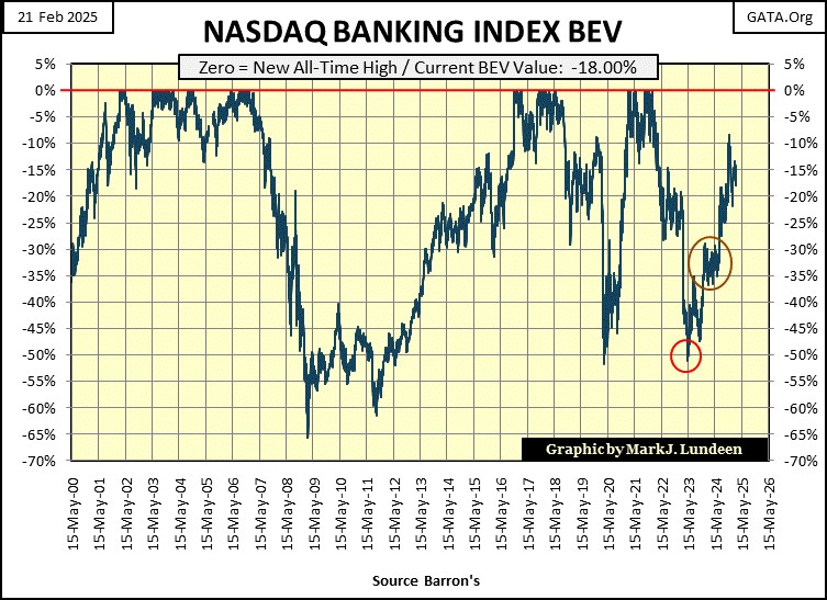
Looking at a BEV chart for the NASDAQ Banking Index (#20 table above, & #22 in the above performance tables), the banking system isn’t looking as well as we would like it to be.
Banks are vital components in our global system of commerce. If via Amazon, or other internet vendors, including the brick-and-mortar establishments, when someone buys something, it’s only possible because the supplier gets paid for selling their goods.
Producers and consumers may be separated by oceans, but they make the connections because the global banking system makes the transfer payments from buyer to producer possible. If the banking system goes down, global, national, and local commerce ceases, as money can no longer flow from buyer to producer.
The banks should be regulated, much like an electrical utility, to prevent their management from doing dodgy dealings in the market. A restoration of the Glass Steagall Act would be a most welcomed event in banking.
Look at the banks below. Since May 2000, their share prices have been very volatile. Their valuation deflated 65% during the sub-prime mortgage debacle, a self-inflicted wound they engineered with their derivatives based “structured finance.”
Remember back in the 1990s, when derivatives were all the rage for “market experts” and economists? They were to be a private market, managed by the banks. These derivatives issued by these banks, were to “place market risks into the hands of those best able to manage them.” Who could be against that?
The sub-prime mortgage debacle happened less than a decade after Washington gave the go-to Wall Street, to do what they wanted with derivatives. The sub-prime mortgage crisis was a derivative crisis, that took these banks down by 65% in March 2009, as global commerce almost shut down as the banking system stood at the edge of the abyss.
It was then we discovered exactly who could best manage the market risks that derivatives shifted them to; the US Treasury, and Federal Reserve, who implemented their QE#1, to bail out the banks.
Since March 2009, these banking stocks once again began making new all-time highs, but twice, Mr Bear clawed-back 50% of their valuation from an all-time high. Lots could be said about the banks’ market action seen above. Being a bullwork of market stability isn’t one of them.
Come the next crisis, I’m expecting to see the banks at the center of it. Maybe then we’ll finally see them regulated as a utility, and the Glass Steagall Act once again implemented.
In the performance tables above, gold remains at #1, as silver advanced from #4 to #2, gaining just under 1% in price. All the other stock indexes fell this week, including the gold and silver miners in the XAU.
How much longer can that go on, seeing gold and silver rise with no effect on their miners? I can’t say, but there are some odd goings on over at the COMEX that may point to a price explosion in the old monetary metals, and their miners sometime in 2025. How odd? Very odd!
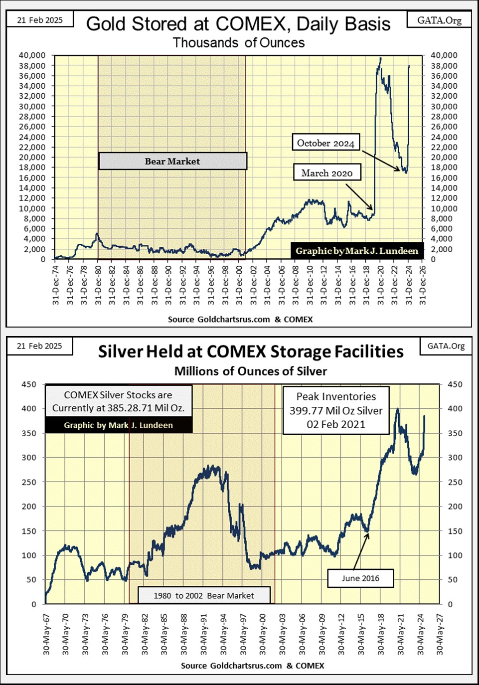
Next are charts for gold and silver inventories held at the COMEX storage facilities, and they are a bit out of the ordinary. For gold, since the March 2020 Flash Crash, inventories for gold bullion at the COMEX have been on a rollercoaster. Rising from 8,000,000 to almost 40,000,000 ounces from March to December 2020.
Inventories then declined to 18,000,000 ounces last October. In the last four months, following Trump’s election victory, they have once again increased drastically, closing this week with 38,590,000 ounces of gold held at COMEX storage facilities.
What does all this mean? Hey, I’m only a market enthusiast with no direct knowledge or contacts on the inside of the COMEX. But looking at this chart for COMEX gold below, I’d say there are some people finding getting a good night’s sleep difficult, for fear of what President Trump and Elon Musk will find when their turn comes for an audit.
Years ago, there was lots of talk about how gold held in storage at the COMEX, and at the London Bullion Market Association (LBMA), was maybe owned by more than just one party. Possibly as many as 100 people were sold the same ounce of gold.
The purchasers of this gold believe they owned the gold they purchased, when actually, or as this theory goes, they only had a paper claim to gold also sold to many others.
Is this possible? Whether or not it is, for someone, this would be a very profitable way of managing the price of gold downward, taking one ounce of gold, to be sold to multiple parties, by the many tons of gold held at the COMEX and other gold and silver bullion storage facilities. Look at all the fraud being discovered by Elon Musk’s DOGE. Should people stand for delivery for their gold from these huge bullion facilities, that could be a BIG Problem.
If Elon Musk’s DOGE wanted to see something interesting, checking out the COMEX sometime in the next year could be something he, and his team should consider. But the COMEX is a private company, not a government agency, so maybe that isn’t going to happen. But to the best of my limited knowledge of the law; selling the same item to multiple people, whether an ounce of gold, or an automobile, is fraudulent.
If this is so, this may be taken up by the Department of Justice, should paper claims to gold stored at COMEX come to grief, as the price of gold explodes from the public realization of a massive gold default at the COMEX.

Geeze Louise! Look at all the changes in gold inventories at the COMEX since March 2020, exactly when the FOMC implemented their multi-trillion dollar, Not QE#4. Is there a connection between the two? Maybe. But if so, or not, nothing like this has happened since 1974. Something very odd is happening at the COMEX!
FYI; a chart for silver being stored at COMEX is posted above. It too looks odd.
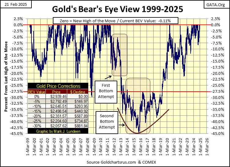
Let’s move on to my BEV chart for gold. Gold looks damn good. Much better than the Dow Jones, because it’s coming off a massive 45% market decline in December 2015. Yes, that was 10 years ago, but bullish market sentiment from the advances seen from 2001 to 2011, have yet to be restored in the minds of the investing public.
So, the price of gold may be going up, but there are not a lot of people enjoying the gains. This is typical of a bull market in its early stages. Ask around your circle of friends and family; who owns gold and who is in the stock market. I suspect way more people will say they own stocks, believing gold ownership is something risky to do with their money.
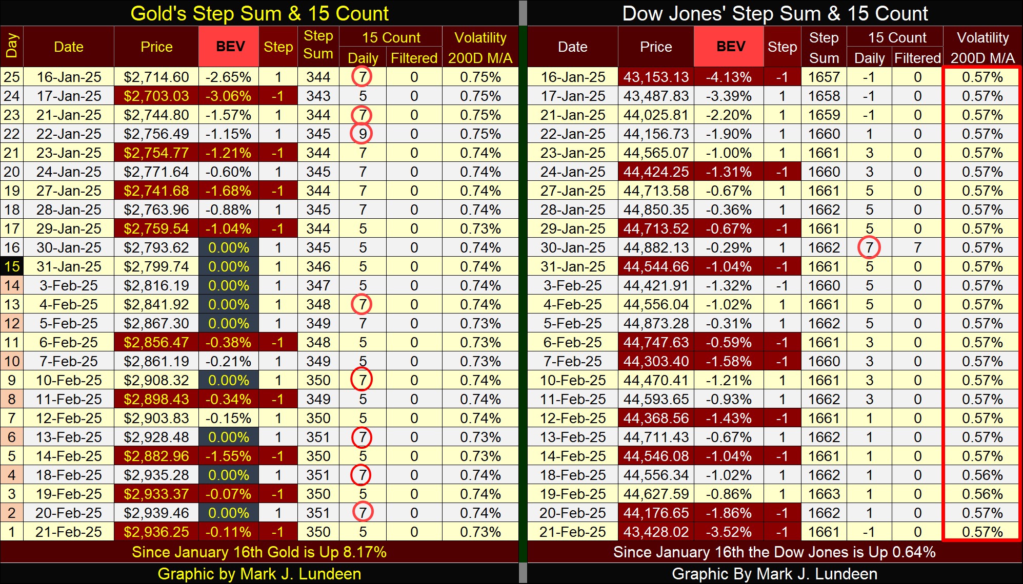
Gold in its step sum table below is on a tear. It has been an overbought market (15-count of +7, or more), for well over a month, and has seen nine new BEV Zeros (new all-time highs) since the end of January.
How long can this go on? I’d usually say not too much longer. But this week, I keep looking at the above chart of the COMEX inventories, and think this time it could be different. That gold may remain an overbought market for a considerable time longer, with plenty of new all-time highs to come in March and April.
As for the Dow Jones side of the step sum table above, I highlighted in Red the Dow Jones Daily Volatility’s 200D M/A. This week closed with it at 0.57%. So what? A daily volatility that low tells us the Dow Jones (my proxy for the broad stock market) is near to a bull market top.
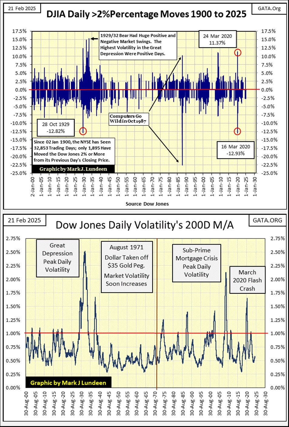
Below, I have two charts for daily volatility for the Dow Jones, going back January 1900, 125 years of market history. The top chart plots the actual daily volatility for the Dow Jones. Bull markets are low volatility markets, that rarely see the Dow Jones move 2%, or more from a previous day’s closing price.
During bear markets, the Dow Jones will build clusters of Dow Jones 2% days, or Days of Extreme Market Volatility in the chart below. A 2% day isn’t necessarily a 2% day. The 2% is a threshold value. So, a day where the Dow Jones moves 5%, or more from a previous day’s closing price, is still called a Day of Extreme Market Volatility; a Dow Jones 2% day.
Note in the chart below, daily volatility during bear markets, the Dow Jones sees about as many positive 2% days as it sees negative 2% days. In fact, the Dow Jones has seen its largest daily advances during bear markets. During the Great Depression Crash, the Dow Jones saw daily advances from a previous day’s close in excess of 12%. During the March 2020 Flash Crash, the Dow Jones saw a one-day advance of 11.37%.
Should the Dow Jones advance by 11.37% next Monday, that would be an advance of 4,928 points from today’s close. But that isn’t going to happen, as we are now in bull market advance.
So, don’t believe a large daily advance during a big market decline is bullish. These extreme daily advances are only Mr Bear’s way of giving the bears’ their fair share of grief, for going short during a bear market decline.
A superior view of the Dow Jones’ daily volatility can be had by converting the daily values into absolute values, then take a running 200D M/A of the data, as seen above.
Why a 200D M/A? Why not, as the results seen in the chart above, identifying bear market bottoms, by their spikes in daily volatility, and bull market tops by their low daily volatility, have been excellent for the past 125 years.
But note, with a 200D M/A, the market’s bottoms and tops seen above come after the actual bottom or top. Even so, the data seen above provides an excellent insight into the stock market. For instance, with the Dow Jones daily volatility’s 200D M/A at this week’s close of only 0.57%, tells us the best part of this market advance, is best seen in the market’s rearview mirror. That the next big thing for the stock market, is a market decline, that will once again push this plot above its 1.00% line.
And when will that happen? That I don’t know. I only know I don’t want any exposure to the stock market when that does happen. That is how I’m reading the chart above for us today. This is an interesting chart. Let’s take a little deeper look at it.
The 1930s, with the Great Depression Crash, and the 1937 to 1938 bear market produced some impressive volatility spikes in Dow Jones daily volatility. The 1930s frightened Wall Street into being honest, for the generations that lived through its trauma. Banks were responsible with their use of credit; no consumer debt for the general public, school loans, or second mortgages. For decades following the trauma of the 1930s, if someone got a loan for an automobile, the loan was from Ford or General Motors, not a bank.
Beginning in the 1940s, daily volatility for the Dow Jones became muted. Though the stock market saw a nice bull market advance from 1942 to 1966, the stock market failed to attract the public’s attention, a public still traumatized by the Great Depression.
But all that changed when the Baby Boomers took leadership positions in the management of high finance, and began investing their savings into the stock market. When did that happen? Look at the chart above; sometime after 1971, when the US took the dollar off the Bretton Woods $35 gold peg.
Freed from the confines of only having as many dollars, as the US Treasury had gold to back them, the Baby Boomers now in control of Wall Street found the inflation flowing from the FOMC very profitable, and Wall Street became a booming place for the bulls.
But with every inflationary boom, comes a deflationary bust, and the volatility spikes for every post August 1971 bear market is seen above;
- 1973-74 Bear Market, first time since 1942 the Dow Jones declined by 45%,
- October 1987 Flash Crash, Dow Jones crashed 22.16% in a single day, on 19 October 1987,
- NASDAQ High-Tech Bear Market, Dow Jones declined 37.85%,
- Sub-Prime Mortgage Bear Market, Dow Jones declined 53.78%,
- March 2020 Flash Crash, Dow Jones declined 37.09% in only twenty-eight trading days,
as the plot of the Dow Jones daily volatility’s 200D M/A spikes above the red 1.00% line.
Currently, with Dow Jones’ daily volatility at only 0.57%, which as the history seen above is low, indicating we are very near a top in a bull market. Knowing that is an important insight into this market; this isn’t a good time for new investment funds to get involved with the stock market. The Market history seen above strongly suggests, that it would be prudent to wait until once again, daily volatility for the Dow Jones once again drive the plot seen above, to levels somewhere well above its red 1.00% line.
For those who followed me into Eskay Mining, a Canadian gold and silver exploration speculation I like, Mac Balkam; Eskay’s CEO, and its largest shareholder, issued a new press release this week.
https://eskaymining.com/news/news-releases/eskay-mining-2025-prospecting-and-mapping-program-9950/
The company announced its plans for their 2025 exploration program, and I’m hopeful their efforts will prove to be fruitful. This is a company with a 130,000 acre claim in the heart of British Columbia’s Golden Triangle, 130,000 acres of promising geology, surrounded by past, and current big gold and silver mines.
I believe Eskay Mining’s property has some massive ore bodies on it too. What makes purchasing Eskay Mining a speculation, is whether or not they can find a big precious metal ore body on their claim. No guarantees on that, but if they do, their current share price of US$0.13 will rise considerably.
So, taking 5% of your funds targeted for investing in gold and silver miners, and speculating on Eskay Mining that they hit it big, is not a bad thing for investors to do.
Mark J. Lundeen
********

