Sign up for daily news updates from CleanTechnica on email. Or follow us on Google News!
Electrify America recently announced an update to the company’s app for both Android and Apple devices. Now, the goal is to get everyone to install the update:
New updates to the Electrify America mobile app are now available!
Make sure you’re getting the most out of our app —download the latest version on iOS (7.15.1) and Android (7.15.0): https://t.co/sjpJftPId4 pic.twitter.com/BIeo6YhZfk
— Electrify America (@ElectrifyAm) July 11, 2024
To get people to update, the company’s social media people let everyone know about what’s improved. First, the charger status “cards” have been updated with a new look. There’s also now the ability to copy and paste station addresses to more easily enter them into navigation. Charge history is now easier to get to, and some other “minor issues” were addressed in the app for both iOS and Android devices.
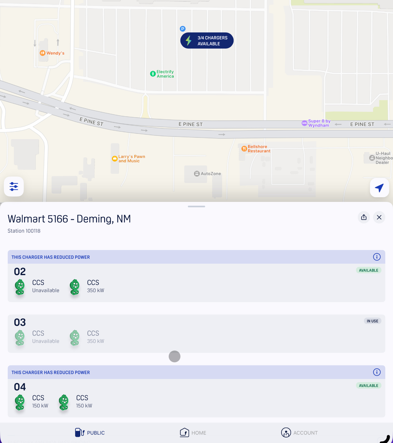
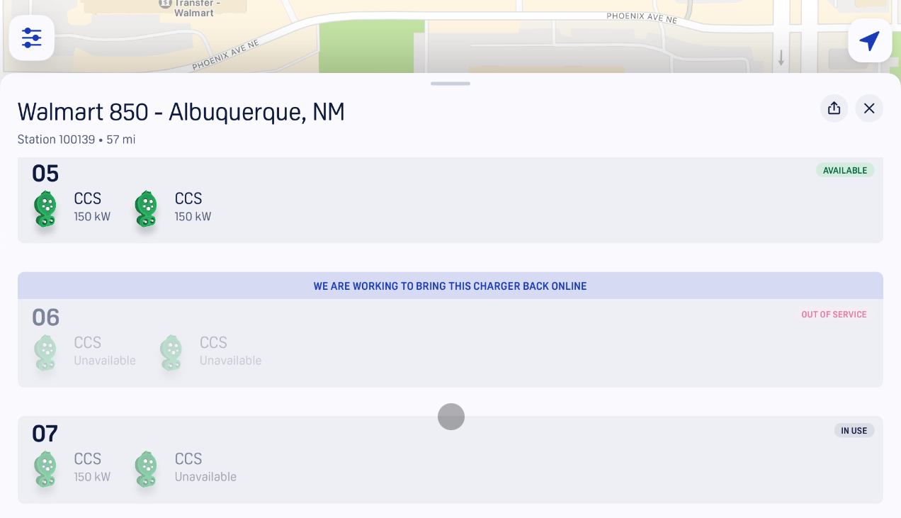
To see what it looks like, I made sure to have the latest version installed on both an iPad I have and a Google Pixel Fold. Here’s an interesting screenshot from the iPad (reduced size for multitasking, of course).
On the upside, I do like that the app is transparent about reduced power now. In the past, you’d be able to see if a station was up or down or in use, but now it gives a clear indication of whether the station is expected to provide full power. In some cases, the reduced power is due to a module that has gone down, while the other modules are still able to provide power. So, techs disable the faulty module so that people can at least get a charge, which is definitely better than stranding people.
Knowing which stalls are slow and which will give full power will reduce the need to move stalls and hunt for the fastest charge, which will save people time and headaches.
On the downside, the app is a lot more “gentle” about stalls that are down.
Instead of having a big red banner to warn you about the stall that’s down, the app now gives a more calm blue banner that says “We are working to bring this charger back online” instead of saying it’d just down. There is a small red text that says “out of service,” but that’s now smaller and less prominent.
I get that the company wants to improve its image, but I also see how this could be less useful for drivers who are in a hurry to find a place to charge on their phones. A station that’s down should be more prominently displayed with a red banner or something else that catches attention. Keeping the more PR-friendly “working to bring this charger back online” message makes sense, but it needs something a little less visually friendly/calm to be seen.
Personally, I think an orange banner with the universal sign for caution (⚠️) would be appropriate here. This is something that would work well for drivers, as orange signs are typically used for construction, while green signs are used for normal situations. This would both get the message about a station being down across easily without being as harsh as red.
Of course, it would be better for the stations to simply be up and working as intended a lot more, as these banners wouldn’t show up as often and potentially give the company a bad image. Hopefully that more fundamental change continues to happen.
Featured image: a screenshot from the Electrify America app on iPadOS.
Have a tip for CleanTechnica? Want to advertise? Want to suggest a guest for our CleanTech Talk podcast? Contact us here.
Latest CleanTechnica.TV Videos
CleanTechnica uses affiliate links. See our policy here.
CleanTechnica’s Comment Policy


